wikislo
Registered
- Thread starter
- #1
Let us look at some more examples of using media queries.
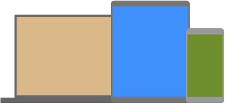
Media queries are a popular technique for delivering a tailored style sheet to different devices. To demonstrate a simple example, we can change the background color for different devices:
here is demo and code
and more...
Media queries are a popular technique for delivering a tailored style sheet to different devices. To demonstrate a simple example, we can change the background color for different devices:
here is demo and code
CSS:
/* Set the background color of body to tan */
body {
  background-color: tan;
}

/* On screens that are 992px or less, set the background color to blue */
@media screen and (max-width: 992px) {
  body {
    background-color: blue;
  }
}

/* On screens that are 600px or less, set the background color to olive */
@media screen and (max-width: 600px) {
  body {
    background-color: olive;
  }
}
and more...
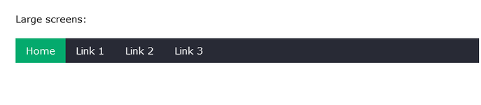
CSS:
 /* The navbar container */
.topnav {
  overflow: hidden;
  background-color: #333;
}

/* Navbar links */
.topnav a {
  float: left;
  display: block;
  color: white;
  text-align: center;
  padding: 14px 16px;
  text-decoration: none;
}

/* On screens that are 600px wide or less, make the menu links stack on top of each other instead of next to each other */
@media screen and (max-width: 600px) {
  .topnav a {
    float: none;
    width: 100%;
  }
}